Have you ever visited a website and thought, "wow, this is nice, I feel comfortable!" I know I have experienced that. Then I go back to my own site and I sigh, wishing that I knew what to do to get that feel that I’m looking for. You know the one, where you’re there and it’s just right. I’ve come up with a few ideas over the years that I’d like to share with you; ones that just might be the thing that makes you sigh with delight when you visit your site (rhyme intended… you’re welcome).
I’m going to hit on a few design ideas throughout my posts, but first up is…
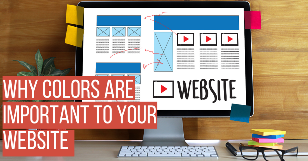
COLOR
Boom, you’re there, you just clicked into a site and you feel good. Why? Maybe it’s the color palette. Pay attention to what captivates you. What in particular do you like about this website and why does work? I know, I already said it… but I’m saying it again. The colors! Notice the tone and contrast that’s used. Ever heard of hue? (Not Hugh… Grant, Jackman, whoever) It’s just a fancy way of saying color but goes a little deeper. It’s the combination of colors that match and/or contrast that has a way of drawing us in, like moths to a fiery and confused death. When we find a color palette that uses different hues, tones, shades, etc., we find art. ART?! Who’s talking about art? We’re here to learn about WEBSITES… get it together!
Right you are… however, I would like to posit that a good website can be a work of art, even if it’s just for something like selling drills. If you find the colors that evoke the feeling you want people to have when they visit your website, you’ll hook them. A good website makes a visitor feel comfortable and draws them in to stay awhile. Say we are selling drills, what colors would look good? I’m picturing a combination of black, silver, and white, with a bold pop of red, orange, or yellow. Something that adds interest and draws attention without being overwhelming. Or maybe your drills are blue, we can play off of that. Use that color to find others that complement and contrast with it. The possibilities are endless.
One of my favorite resources for color design is coolors.co, it’s easy to use and comes up with some really great schemes; you can even lock in one or two of your main colors and have it generate color schemes to go with it (them). There are a lot of options when it comes to colors and I would recommend taking some time to explore a few. You don’t have to be a graphic designer to figure this out, you’re a perfectly good human, and that’s enough.