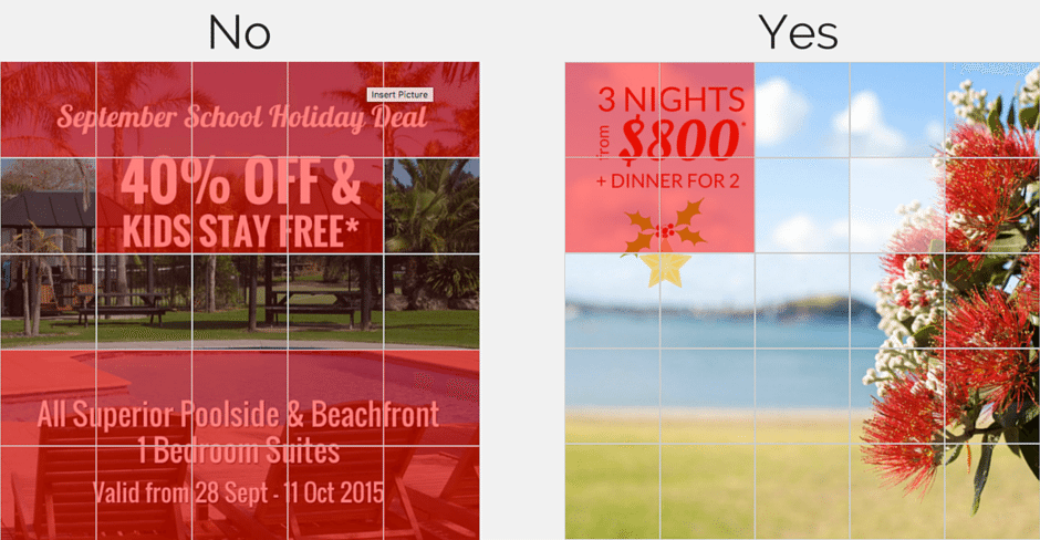
If you decide to promote or boost a post on Facebook (I totally think you should do) so you can reach your target market, then you need to create graphics that have less than 20% text.
First I thought what a stupid idea, 20% is not enough to gain enough attention for my marketing purposes. But the main reason for this is so that timelines don’t get “spammed” with forceful and aggressive “Buy, Buy, Buy” campaigns, which are very annoying right? Let’s look at it as Facebook’s way of saying “no door knocking please!” The good news is that, in order to create graphics “that speak for themselves”, we don’t need a whole bunch of text on them. Yay!
Let me give you some great tips on how to create & test your graphics in three easy steps:
1) Use content in your post description that converts; meaning that you can use the written description to sell your services or products. Keep it simple and only use one selling message at the time. I recommend, and so does Facebook, to keep it to under 500 words.

2) Test your images with Facebook’s Grid “overlay text tool” Upload your image onto here to easily check if it complies with the Facebook advertisement guidelines of having 20% or less text on an image. Simply upload your image on this link.
3) A picture speaks more than a 1000 words. Use powerful images that do the talking for you. People are drawn to great images so keeping text to a minimum will help the image to do the talking.
